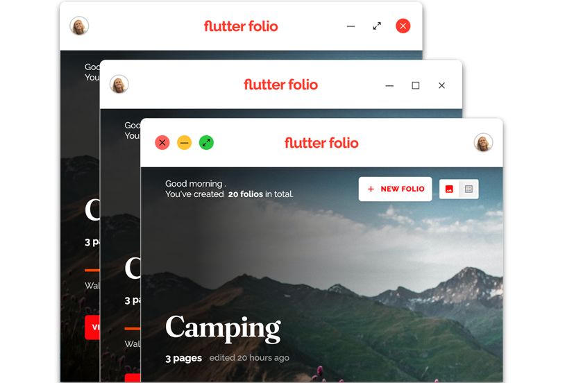
Developing a Flutter App for Every Screen: Part 3/3

In my previous article: Developing a Flutter App for Every Screen: Part 2/3 where I looked at building adaptive layouts I focused on Layouts and promised to focus on inputs, idioms and norms in this article. This is a journey of understanding how the Flutter framework can spearhead the development of apps for any kind of screen regardless of the platform or screen size. When I understand anything it becomes your benefit also. Welcome!
2. Building Adaptive Inputs
Adapting the appearance of your app is not sufficient, you must also accommodate different user inputs. Mouse and keyboard add input methods not found on touch devices, such as
The scroll wheel, right-click, hover interactions
Tab traversal
Keyboard accelerators
Mouse enter, exit, hover
a. Scroll wheel
Scrolling widgets like ScrollView or ListView support the scroll wheel by default. As a result, nearly all custom scrollable widgets, which are built using these widgets, also work with the scroll wheel.
For custom scroll behavior, you can utilize the Listener widget, which enables you to customize how your UI reacts to the scroll wheel.
return Listener(
    onPointerSignal: (event) {
      if (event is PointerScrollEvent) print(event.scrollDelta.dy);
    },
    child: ListView());
b. Tab traversal and focus interactions
Users who use physical keyboards anticipate the ability to use the tab key for quick navigation in your application. Additionally, users with motor or vision impairments often solely rely on keyboard navigation.
There are two considerations for tab interactions:
Tab traversal - how focus moves from widget to widget.
Visual highlight - is shown when a widget is focused.
Buttons and text fields, among some of the built-in components support traversal and highlights by default.
You can write your widgets to be included in traversal, using the FocusableActionDetector widget. It combines the functionality of Actions, Shortcuts, MouseRegion, and Focus widgets to create a detector that defines actions and key bindings, and provides callbacks for handling focus and hover highlights.
class _BasicActionDetectorState extends State<BasicActionDetector> {
  bool _hasFocus = false;
  @override
  Widget build(BuildContext context) {
    return FocusableActionDetector(
      onFocusChange: (value) => setState(() => _hasFocus = value),
      actions: <Type, Action<Intent>>{
        ActivateIntent: CallbackAction<Intent>(onInvoke: (intent) {
          print('Enter or Space was pressed!');
          return null;
        }),
      },
      child: Stack(
        clipBehavior: Clip.none,
        children: [
          FlutterLogo(size: 100),
          // Position focus in the negative margin for a cool effect
          if (_hasFocus)
            Positioned(
                left: -4,
                top: -4,
                bottom: -4,
                right: -4,
                child: _roundedBorder())
        ],
      ),
    );
  }
}
Controlling traversal order
To get more control over the order that widgets are focused on when the user presses tab, you can use FocusTraversalGroup to define sections of the tree that should be treated as a group when tabbing.
For example, you might to tab through all the fields in a form before tabbing to the submit button:
return Column(children: [
  FocusTraversalGroup(
    child: MyFormWithMultipleColumnsAndRows(),
  ),
  SubmitButton(),
]);
Flutter has several built-in ways to traverse widgets and groups, defaulting to the ReadingOrderTraversalPolicy class. This class usually works well, but it’s possible to modify this using another predefined TraversalPolicy class or by creating a custom policy.
c. Keyboard accelerators
Aside from tab traversal, desktop and web users are familiar with keyboard shortcuts that are assigned to specific actions. Examples include the Delete key for swift deletions or Control+N for creating a new document. It is important to take into account the various shortcuts your users expect. The keyboard is an efficient input tool, so make the most of it for the benefit of your users.
Keyboard accelerators can be accomplished in a few ways in Flutter depending on your goals:
RawKeyboardListener
Shortcuts Widget
Global Listener
i) RawKeyboardListener - it can be used to listen to keyboard events and wrap a single widget like a TextField or a Button since it already has a focus node.
  @override
  Widget build(BuildContext context) {
    return Focus(
      onKey: (node, event) {
        if (event is RawKeyDownEvent) {
          print(event.logicalKey);
        }
        return KeyEventResult.ignored;
      },
      child: ConstrainedBox(
        constraints: BoxConstraints(maxWidth: 400),
        child: TextField(
          decoration: InputDecoration(
            border: OutlineInputBorder(),
          ),
        ),
      ),
    );
  }
}
ii) Shortcuts Widget - It is used where you'd like to apply a set of keyboard shortcuts to a large section of the tree. It is useful because it only allows shortcuts to be fired when this widget tree or one of its children has a focus and is visible.
// Define a class for each type of shortcut action you want
class CreateNewItemIntent extends Intent {
  const CreateNewItemIntent();
}

Widget build(BuildContext context) {
  return Shortcuts(
    // Bind intents to key combinations
    shortcuts: <ShortcutActivator, Intent>{
      SingleActivator(LogicalKeyboardKey.keyN, control: true):
          CreateNewItemIntent(),
    },
    child: Actions(
      // Bind intents to an actual method in your code
      actions: <Type, Action<Intent>>{
        CreateNewItemIntent: CallbackAction<CreateNewItemIntent>(
            onInvoke: (intent) => _createNewItem()),
      },
      // Your sub-tree must be wrapped in a focusNode, so it can take focus.
      child: Focus(
        autofocus: true,
        child: Container(),
      ),
    ),
  );
}
iii) Global listener - It can be used for always-on, app-wide shortcuts or for panels that can accept shortcuts whenever they’re visible (regardless of their focus state). Adding global listeners is easy with the RawKeyboard:
void initState() {
  super.initState();
  RawKeyboard.instance.addListener(_handleKey);
}

@override
void dispose() {
  RawKeyboard.instance.removeListener(_handleKey);
  super.dispose();
}
To check key combinations with the global listener, you can use the RawKeyboard.instance.keysPressed map. For example, a method like the following can check whether any of the provided keys are being held down:
static bool isKeyDown(Set<LogicalKeyboardKey> keys) {
  return keys.intersection(RawKeyboard.instance.keysPressed).isNotEmpty;
}
Putting these two things together, you can fire an action when Shift+N is pressed:
void _handleKey(event) {
  if (event is RawKeyDownEvent) {
    bool isShiftDown = isKeyDown({
      LogicalKeyboardKey.shiftLeft,
      LogicalKeyboardKey.shiftRight,
    });
    if (isShiftDown && event.logicalKey == LogicalKeyboardKey.keyN) {
      _createNewItem();
    }
  }
}
One note of caution when using the static listener is that you often need to disable it when the user is typing in a field or when the widget it’s associated with is hidden from view. Unlike with Shortcuts or RawKeyboardListener, this is your responsibility to manage. This can be especially important when you’re binding a Delete/Backspace accelerator for Delete, but then have child TextFields that the user might be typing in.
d. Mouse enter, exit, and hover
On desktop, it’s common to change the mouse cursor to indicate the functionality about the content the mouse is hovering over. For example, you usually see a hand cursor when you hover over a button, or an I cursor when you hover over text.
The Material Component set has built-in support for your standard button and text cursors. To change the cursor from within your own widgets, use MouseRegion:
// Show hand cursor
return MouseRegion(
  cursor: SystemMouseCursors.click,
  // Request focus when clicked
  child: GestureDetector(
    onTap: () {
      Focus.of(context).requestFocus();
      _submit();
    },
    child: Logo(showBorder: hasFocus),
  ),
);
MouseRegion is also useful for creating custom rollover and hover effects:
return MouseRegion(
  onEnter: (_) => setState(() => _isMouseOver = true),
  onExit: (_) => setState(() => _isMouseOver = false),
  onHover: (e) => print(e.localPosition),
  child: Container(
    height: 500,
    color: _isMouseOver ? Colors.blue : Colors.black,
  ),
);
Idioms and norms
The final area to consider for adaptive apps is platform standards. Each platform has its own idioms and norms; these nominal or de facto standards inform user expectations of how an application should behave. Thanks, in part to the web, users are accustomed to more customized experiences, but reflecting these platform standards can still provide significant benefits:
Reduce cognitive load—By matching the user’s existing mental model, accomplishing tasks becomes intuitive, which requires less thinking, boosts productivity, and reduces frustrations.
Build trust—Users can become wary or suspicious when applications don’t adhere to their expectations. Conversely, a UI that feels familiar can build user trust and can help improve the perception of quality. This often has the added benefit of better app store ratings—something we can all appreciate!
Consider expected behavior on each platform
The first step is to spend some time considering what the expected appearance, presentation, or behavior is on this platform. Try to forget any limitations of your current implementation, and just envision the ideal user experience. Work backwards from there.
Another way to think about this is to ask, “How would a user of this platform expect to achieve this goal?” Then, try to envision how that would work in your app without any compromises.
This can be difficult if you aren’t a regular user of the platform. You might be unaware of the specific idioms and can easily miss them completely. For example, a lifetime Android user will likely be unaware of platform conventions on iOS, and the same holds true for macOS, Linux, and Windows. These differences might be subtle to you, but be painfully obvious to an experienced user.
Find a platform advocate
If possible, assign someone as an advocate for each platform. Ideally, your advocate uses the platform as their primary device, and can offer the perspective of a highly opinionated user. To reduce the number of people, combine roles. Have one advocate for Windows and Android, one for Linux and the web, and one for Mac and iOS.
The goal is to have constant, informed feedback so the app feels great on each platform. Advocates should be encouraged to be quite picky, calling out anything they feel differs from typical applications on their device. A simple example is how the default button in a dialog is typically on the left on Mac and Linux, but is on the right on Windows. Details like that are easy to miss if you aren’t using a platform on a regular basis.
Stay unique
Conforming to expected behaviors doesn’t mean that your app needs to use default components or styling. Many of the most popular multiplatform apps have very distinct and opinionated UIs including custom buttons, context menus, and title bars.
The more you can consolidate styling and behavior across platforms, the easier development and testing will be. The trick is to balance creating a unique experience with a strong identity, while respecting the norms of each platform.
Common idioms and norms to consider
Take a quick look at a few specific norms and idioms you might want to consider, and how you could approach them in Flutter.
i) Scrollbar appearance and behavior
Desktop and mobile users expect scrollbars, but they expect them to behave differently on different platforms. Mobile users expect smaller scrollbars that only appear while scrolling, whereas desktop users generally expect omnipresent, larger scrollbars that they can click or drag.
Flutter comes with a built-in Scrollbar widget that already has support for adaptive colors and sizes according to the current platform. The one tweak you might want to make is to toggle alwaysShown when on a desktop platform:
return Scrollbar(
  thumbVisibility: DeviceType.isDesktop,
  controller: _scrollController,
  child: GridView.count(
      controller: _scrollController,
      padding: EdgeInsets.all(Insets.extraLarge),
      childAspectRatio: 1,
      crossAxisCount: colCount,
      children: listChildren),
);
This subtle attention to detail can make your app feel more comfortable on a given platform.
ii) Multi-select
Dealing with multi-select within a list is another area with subtle differences across platforms:
static bool get isSpanSelectModifierDown =>
    isKeyDown({LogicalKeyboardKey.shiftLeft, LogicalKeyboardKey.shiftRight});
To perform a platform-aware check for control or command, you can write something like this:
static bool get isMultiSelectModifierDown {
  bool isDown = false;
  if (Platform.isMacOS) {
    isDown = isKeyDown(
        {LogicalKeyboardKey.metaLeft, LogicalKeyboardKey.metaRight});
  } else {
    isDown = isKeyDown(
        {LogicalKeyboardKey.controlLeft, LogicalKeyboardKey.controlRight});
  }
  return isDown;
}
A final consideration for keyboard users is the Select All action. If you have a large list of items of selectable items, many of your keyboard users will expect that they can use Control+A to select all the items.
Touch devices
On touch devices, multi-selection is typically simplified, with the expected behavior being similar to having the isMultiSelectModifier down on the desktop. You can select or deselect items using a single tap, and will usually have a button to Select All or Clear the current selection.
How you handle multi-selection on different devices depends on your specific use cases, but the important thing is to make sure that you’re offering each platform the best interaction model possible.
iii) Selectable text
A common expectation on the web (and to a lesser extent desktop) is that most visible text can be selected with the mouse cursor. When text is not selectable, users on the web tend to have an adverse reaction.
Luckily, this is easy to support with the SelectableText widget:
return SelectableText('Select me!');
To support rich text, then use TextSpan:
return SelectableText.rich(
  TextSpan(
    children: [
      TextSpan(text: 'Hello'),
      TextSpan(text: 'Bold', style: TextStyle(fontWeight: FontWeight.bold)),
    ],
  ),
);
iv) Title bars
On modern desktop applications, it’s common to customize the title bar of your app window, adding a logo for stronger branding or contextual controls to help save vertical space in your main UI.
This isn’t supported directly in Flutter, but you can use the bits_dojo package to disable the native title bars, and replace them with your own.
This package lets you add whatever widgets you want to the TitleBar because it uses pure Flutter widgets under the hood. This makes it easy to adapt the title bar as you navigate to different sections of the app.
v) Context menus and tooltips
On desktop, there are several interactions that manifest as a widget shown in an overlay, but with differences in how they’re triggered, dismissed, and positioned:
Context menu—Typically triggered by a right-click, a context menu is positioned close to the mouse, and is dismissed by clicking anywhere, selecting an option from the menu, or clicking outside it.
Tooltip—Typically triggered by hovering for 200-400ms over an interactive element, a tooltip is usually anchored to a widget (as opposed to the mouse position) and is dismissed when the mouse cursor leaves that widget.
Popup panel (also known as flyout)—Similar to a tooltip, a popup panel is usually anchored to a widget. The main difference is that panels are most often shown on a tap event, and they usually don’t hide themselves when the cursor leaves. Instead, panels are typically dismissed by clicking outside the panel or by pressing a Close or Submit button.
To show basic tooltips in Flutter, use the built-in Tooltip widget:
return const Tooltip(
  message: 'I am a Tooltip',
  child: Text('Hover over the text to show a tooltip.'),
);
Flutter also provides built-in context menus when editing or selecting text.
To show more advanced tooltips, popup panels, or create custom context menus, you either use one of the available packages, or build it yourself using a Stack or Overlay.
Some available packages include:
While these controls can be valuable for touch users as accelerators, they are essential for mouse users. These users expect to right-click things, edit content in place, and hover for more information. Failing to meet those expectations can lead to disappointed users, or at least, a feeling that something isn’t quite right.
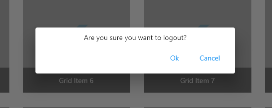
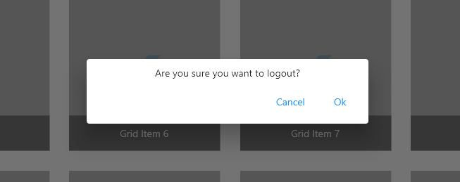
vi) Horizontal button order
On Windows, when presenting a row of buttons, the confirmation button is placed at the start of the row (left side). On all other platforms, it’s the opposite. The confirmation button is placed at the end of the row (right side).
This can be easily handled in Flutter using the TextDirection property on Row:
TextDirection btnDirection =
    DeviceType.isWindows ? TextDirection.rtl : TextDirection.ltr;
return Row(
  children: [
    Spacer(),
    Row(
      textDirection: btnDirection,
      children: [
        DialogButton(
            label: 'Cancel',
            onPressed: () => Navigator.pop(context, false)),
        DialogButton(
            label: 'Ok', onPressed: () => Navigator.pop(context, true)),
      ],
    ),
  ],
);
vii) Menu bar
Another common pattern on desktop apps is the menu bar. On Windows and Linux, this menu lives as part of the Chrome title bar, whereas on macOS, it’s located along the top of the primary screen.
Currently, you can specify custom menu bar entries using a prototype plugin, but it’s expected that this functionality will eventually be integrated into the main SDK.
It’s worth mentioning that on Windows and Linux, you can’t combine a custom title bar with a menu bar. When you create a custom title bar, you’re replacing the native one completely, which means you also lose the integrated native menu bar.
If you need both a custom title bar and a menu bar, you can achieve that by implementing it in Flutter, similar to a custom context menu.
viii) Drag and drop
One of the core interactions for both touch-based and pointer-based inputs is drag and drop. Although this interaction is expected for both types of input, there are important differences to think about when it comes to scrolling lists of draggable items.
Generally speaking, touch users expect to see drag handles to differentiate draggable areas from scrollable ones, or alternatively, to initiate a drag by using a long press gesture. This is because scrolling and dragging are both sharing a single finger for input.
Mouse users have more input options. They can use a wheel or scrollbar to scroll, which generally eliminates the need for dedicated drag handles. If you look at the macOS Finder or Windows Explorer, you’ll see that they work this way: you just select an item and start dragging.
In Flutter, you can implement drag and drop in many ways. Discussing specific implementations is outside the scope of this article, but some high level options are:
Use the
DraggableandDragTargetAPIs directly for a custom look and feel.Hook into
onPangesture events, and move an object yourself within a parentStack.Use one of the pre-made list packages on pub.dev.
Don't fail to Follow me here and On
Twitter @ JacksiroKe
Linked In Jack Siro
Github @ JacksiroKe


